
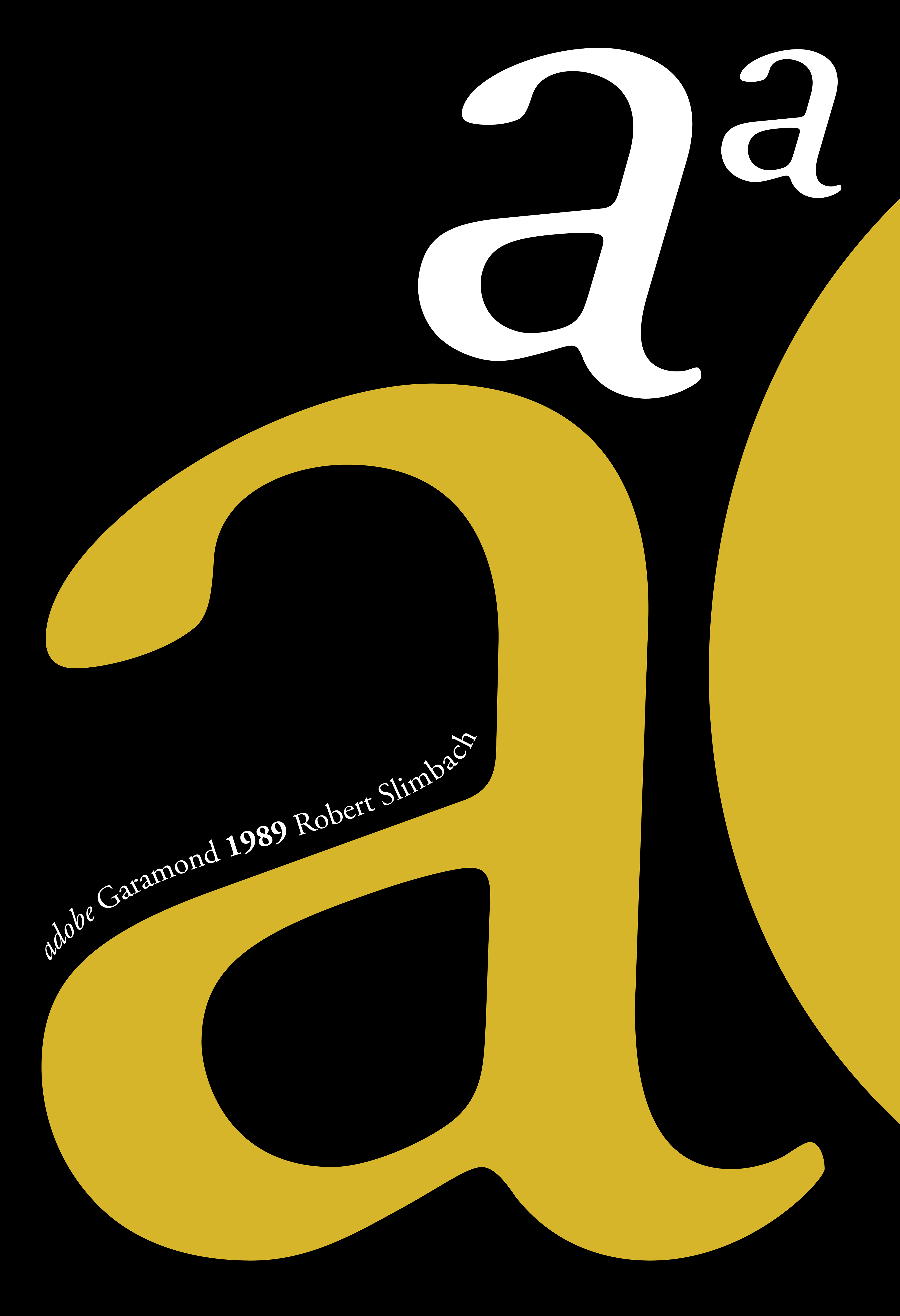
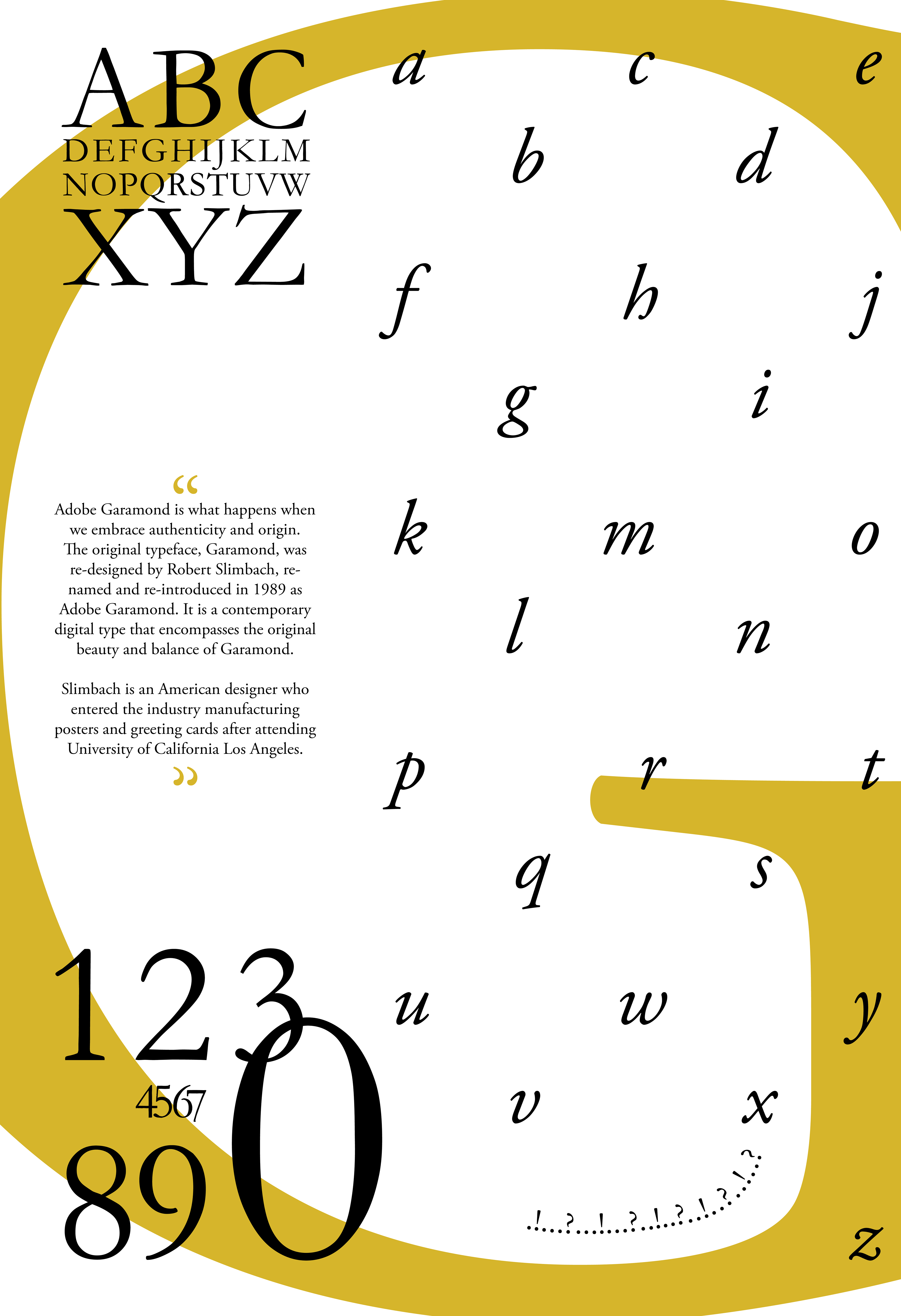
Adobe Garamond Typography Study
Book Cover Redesign | "Homer's The Odyssey"
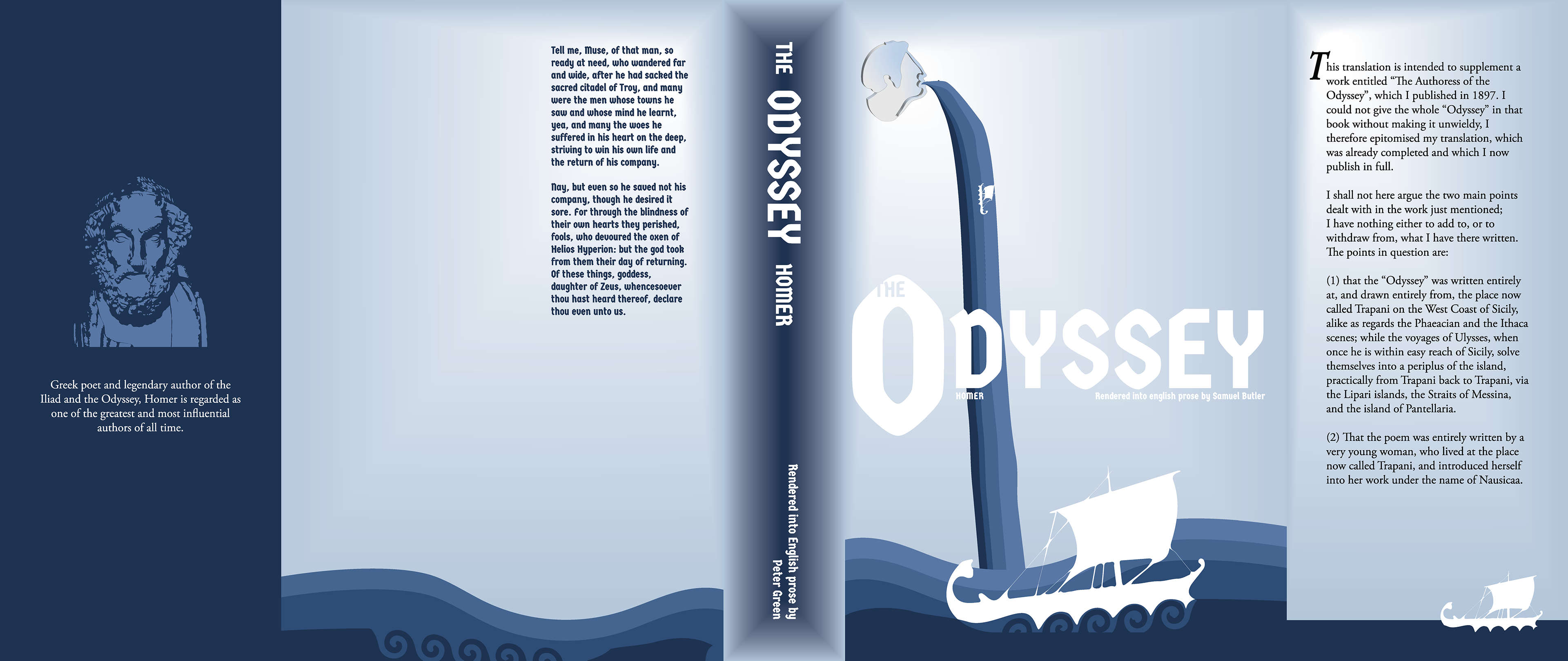
Final Sleeve Design
Problem: using an existing public domain book (found on Project Gutenberg) design a book sleeve including the inner folds, front, back, and spine. Find the physical book and take measurements so that the printed sleeve fits snug around the book.
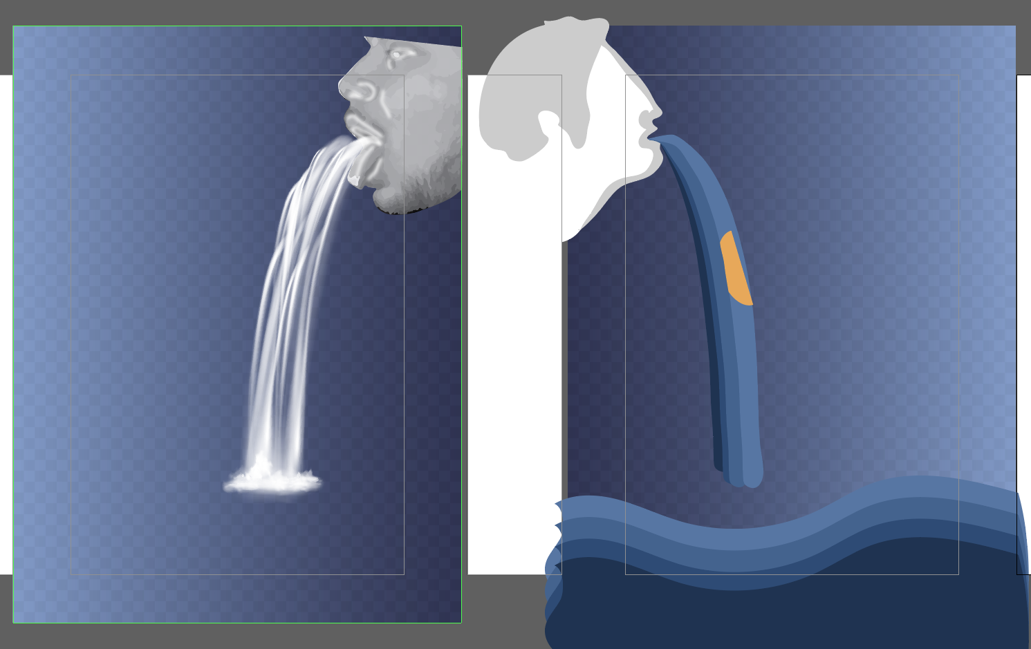
Solution: Homer's The Odyssey is storytelling, spoken epics, and a rumor worth sharing. This idea is what inspired the waterfall spewing out of the floating head on the front cover. The ocean of thoughts, feelings, and words is what the boats sail through in this story. The heavy type compliments the boldness of Homer and his strength throughout his journey. Gradients provide shape and visual interest to the otherwise 2D designs and are contrasted with the shadows of the 3D floating head.
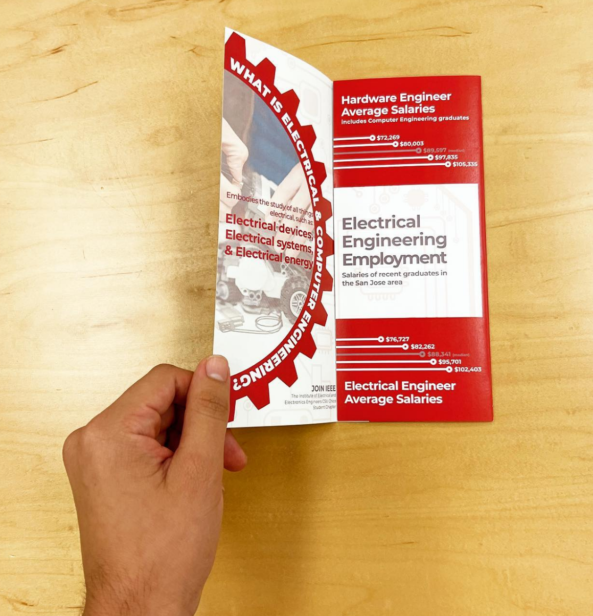
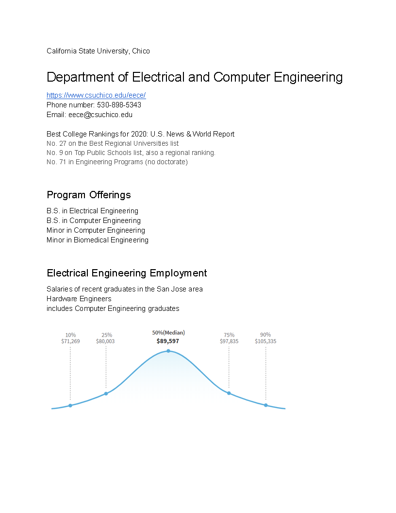
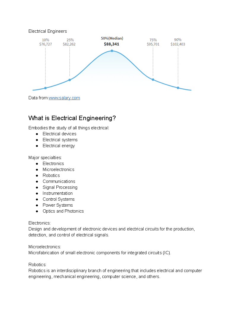
Informational Tri-Fold Pamphlet | Electrical & Computer Engineering | Chico State University


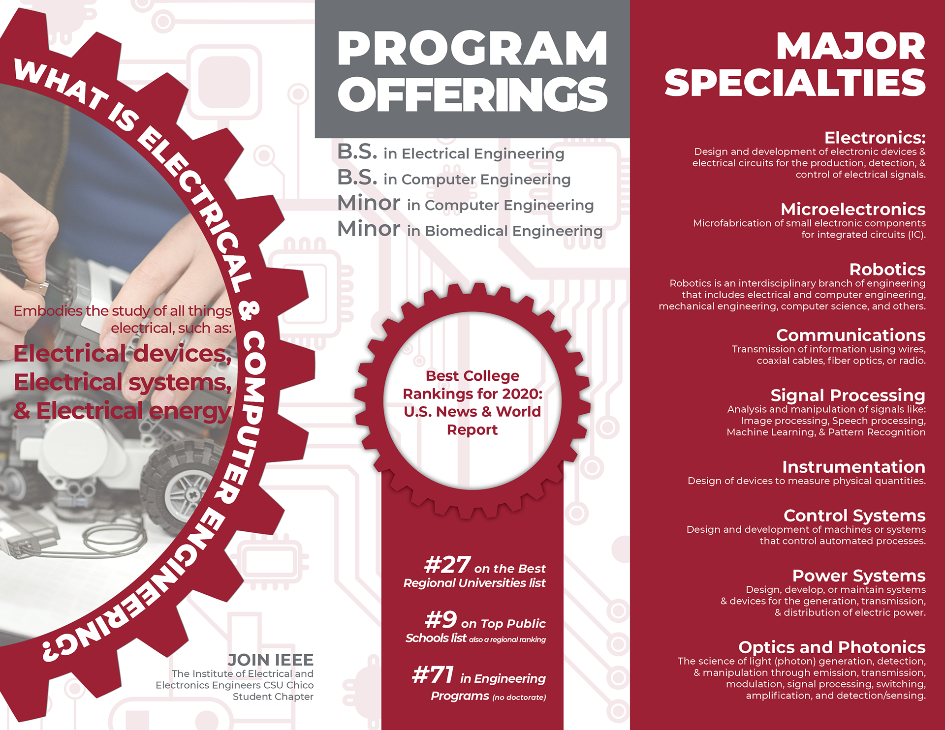
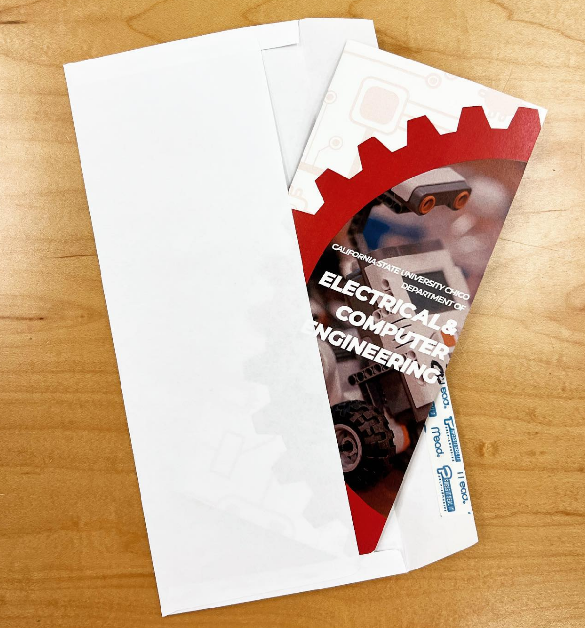
Problem: Use provided copy and statistics to create a visually compelling tri-fold brochure that fits within standard envelope dimensions (6" x 9 1/2"). This pamphlet will be used to inform prospective Chico State student who may be interested in the Electrical and Computer Engineering department.
Solution: I compartmentalized the copy provided into their own sections within the pamphlet to provide a visual flow of information. I added graphic elements like the lollipop graph and the ribbon graphic to help visualize these data for the salaries and college rankings, respectively. Following Chico State's identity guidelines allowed me to develop a pamphlet that is consistent with what the university may produce

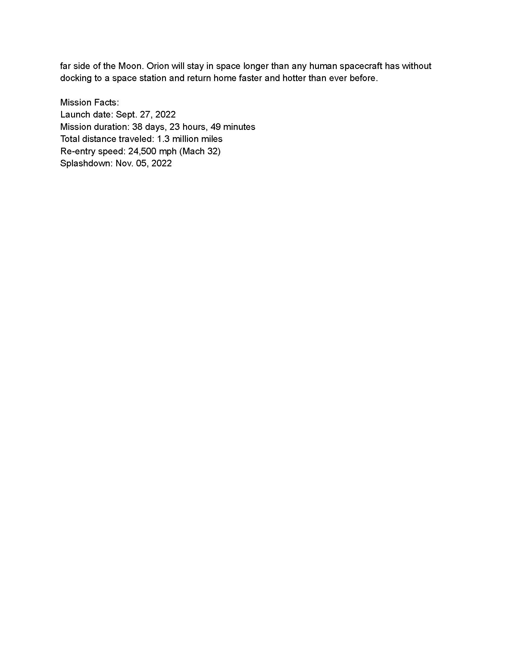
Magazine Layout | NASA
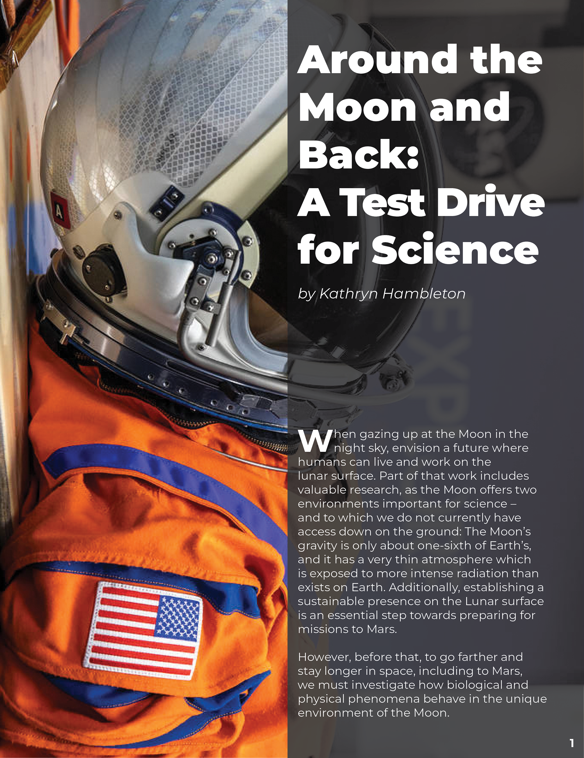
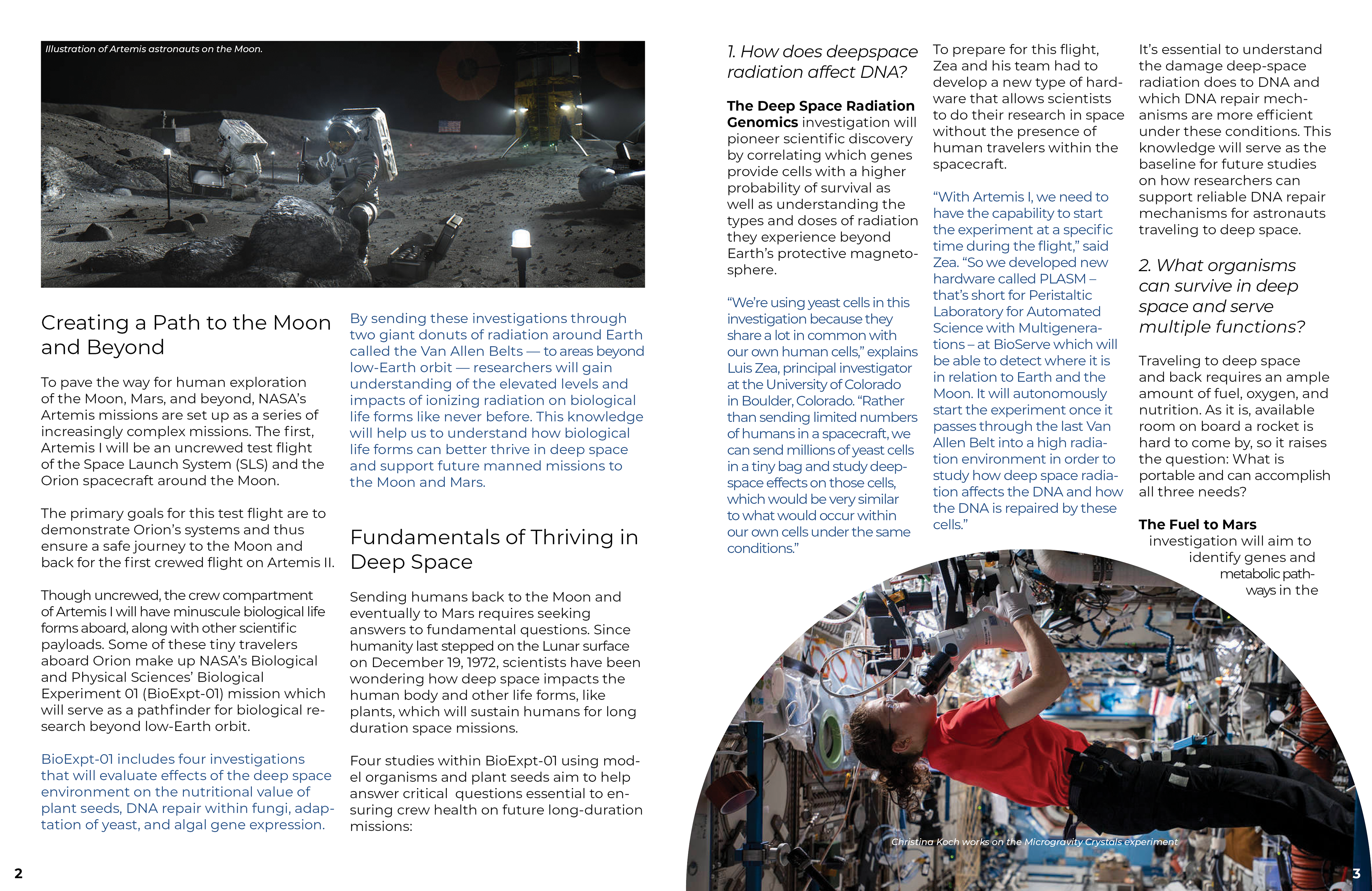
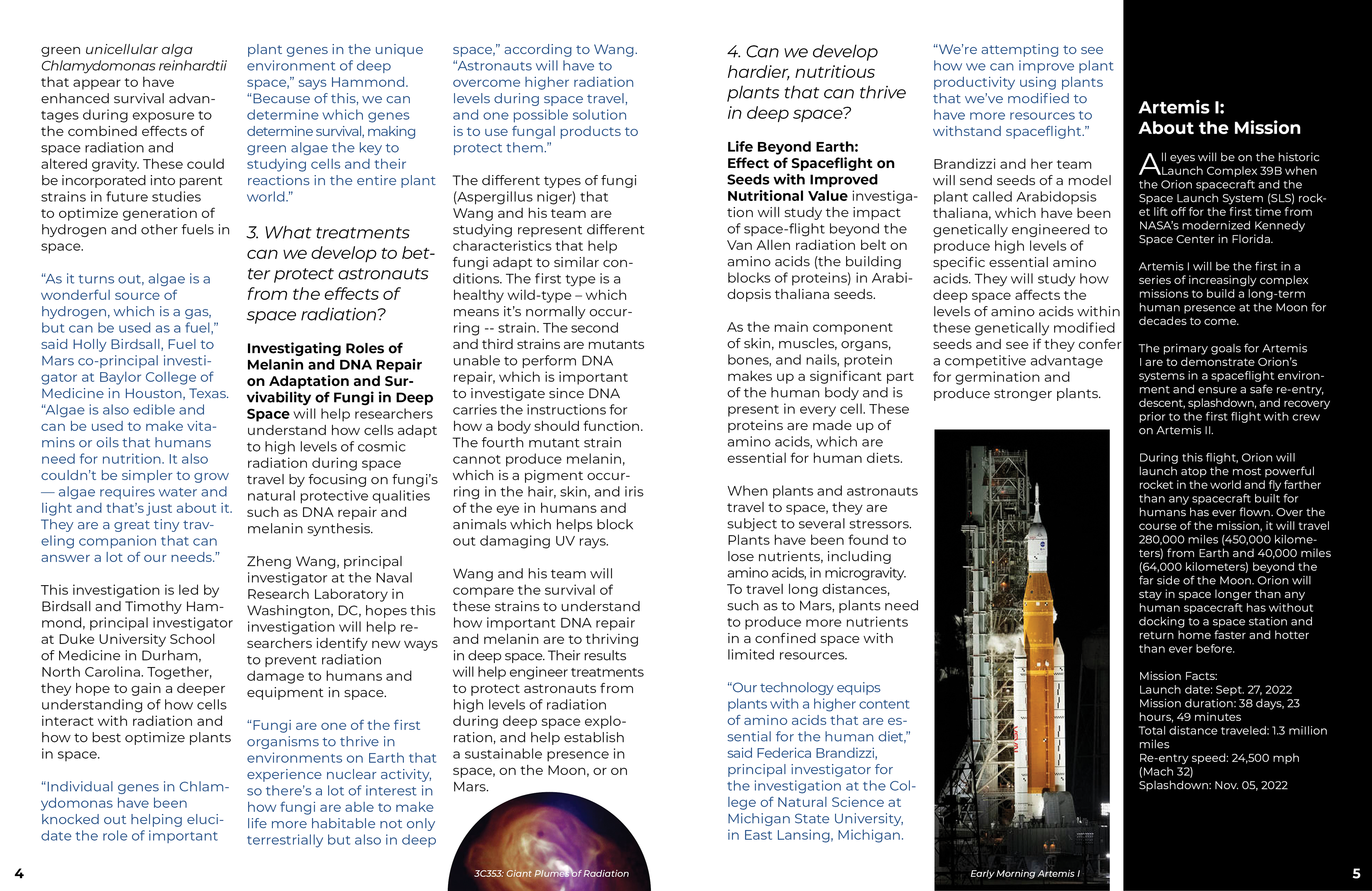
Problem: Use provided copy and information to design an editorial layout for a hypothetical featured article.
Solution: Using grids and columns in Adobe InDesign, I laid out all of the provided copy and applied paragraph styles to my headers, quotes, and body copy. Using public domain images from NASA, I applied imagery that best worked for the article and created a layout that was fun to look at as much as it was interesting to read.
Infographic | Highlighting Fountain House
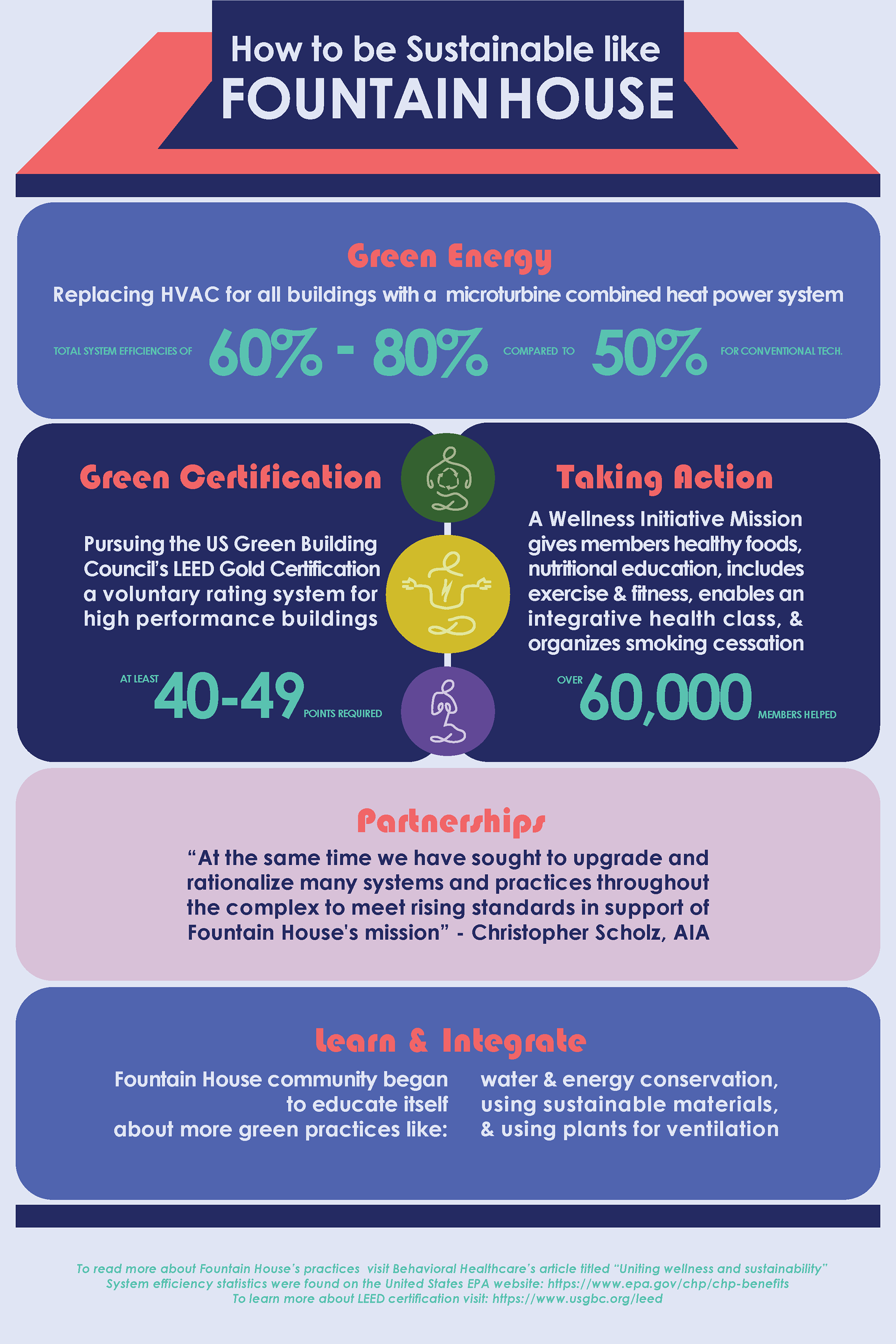
Problem: Create an infographic highlighting a sustainable organization or company. Include important features, what makes them sustainable, and develop a digital way to present this infographic on social media.
Solution: Condensing information was essential to providing easy to digest and informative content inside the infographic. This also allowed for easy implementation in different formats. Colors were important to use here to provide information hierarchy and to call attention to important figures.
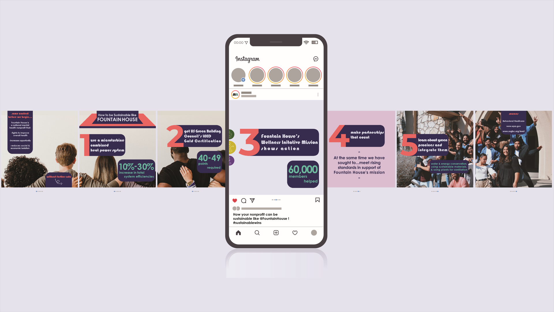
Infographic as an Instagram carousel
Information Design "QUANTIFIED SELF" | A Week Of Marc's Time
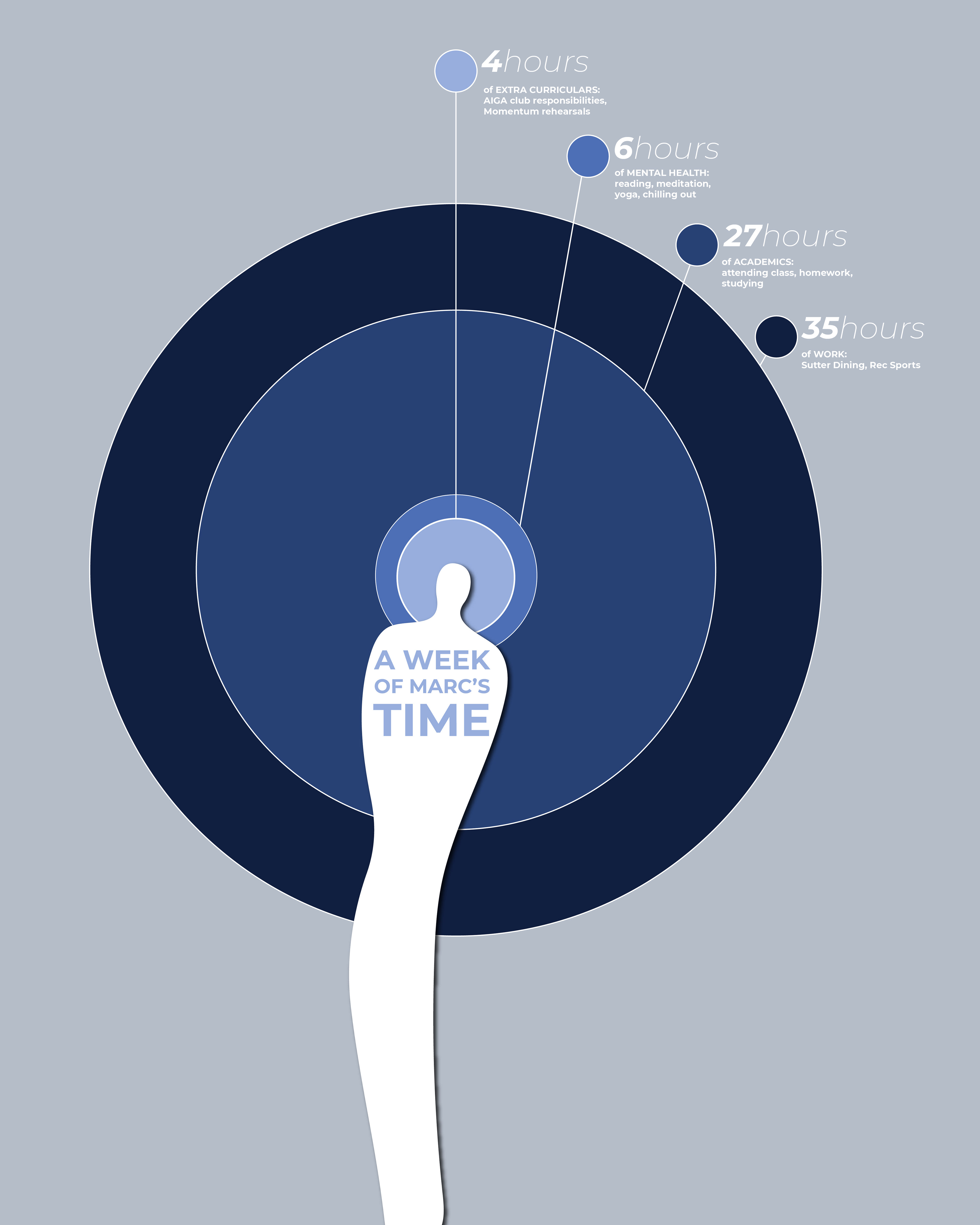
Problem: Observe your daily actions and record the amount of hours spent on certain activities within a week.
Solution: By identifying my daily habits I was able to categorize my activities and sum up the amount of time I spent doing such activities within the "Extra Curriculars", "Mental Health", "Academics", and "Work" categories. After having my information, I prepared to visualize it as a target (thinking about goals and how to achieve them) and then I used lollipop type markers to indicate which category pertained two which ring on the target.
Information Design | How Art Affects the Brain
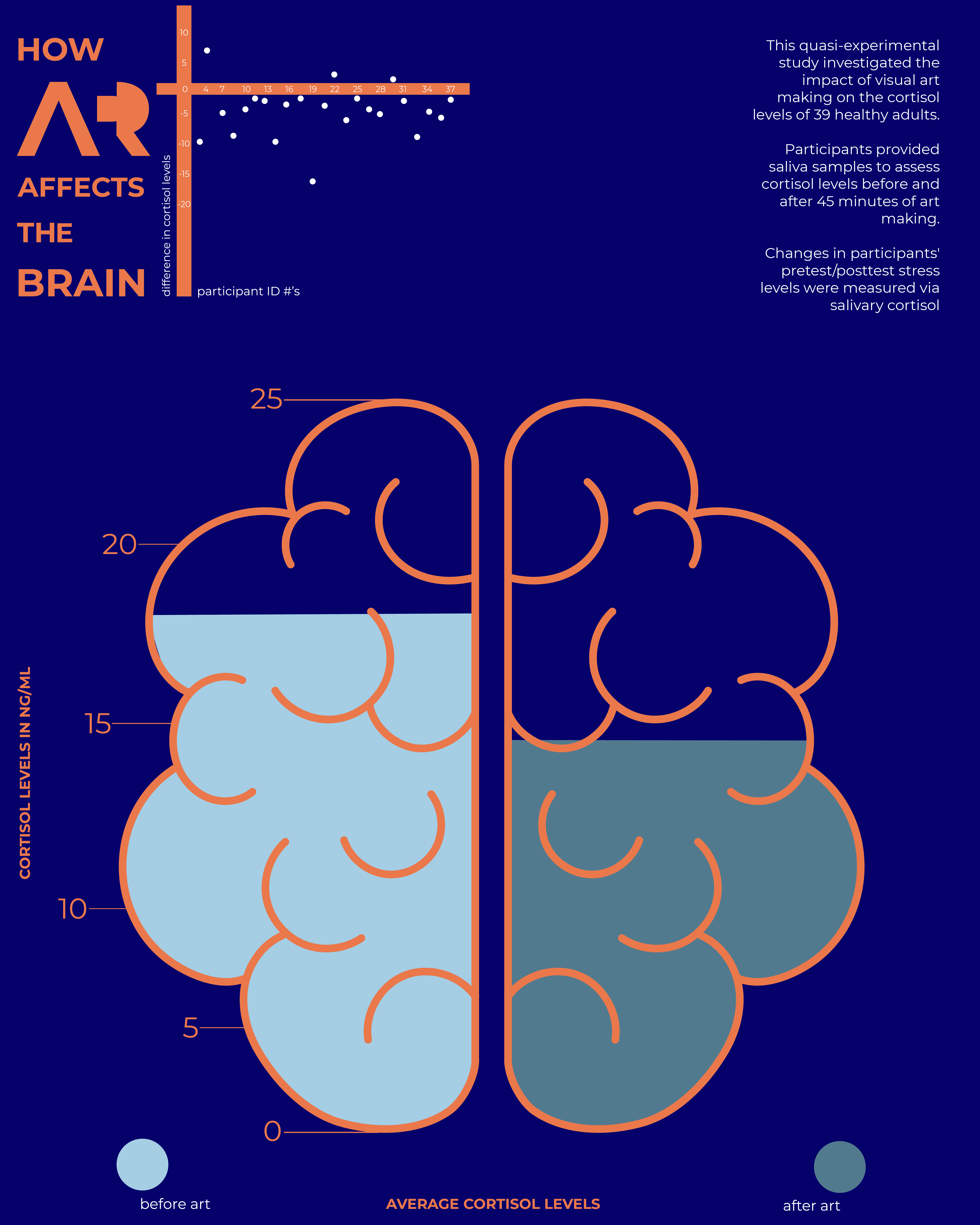
Problem: Use a research study to find and re-interpret their data into a visually compelling poster.
Solution: The study I referenced is called "Reduction of Cortisol Levels and Participants' Responses Following Art Making" by Girija Kaimal, Kendra Ray, and Juan Muniz. I used two different graphs that were included in the study: the change in salivary cortisol levels on each participant as well as the overall change before and after art making.
On the top left is my version of the graph that indicates the change in salivary cortisol levels on each participant using the "t" in "ART". The y-axis pertains to the difference in cortisol levels while the x-axis pertains to the participant ID numbers. The most important change I wanted to focus on was the average cortisol levels before and after art making. This is seen inside the brain illustration with numbers indicating the average cortisol levels in ng/ml.
Brain vector by rawpixel.com on Freepik